Images
Photography brings our site to life. Use this page as a guide for working with images.
Copyright Note: Editors should only use images for which Purdue University Northwest holds the copyright or stock images that have been purchased or licensed for use. If you have a question about whether an image should be used, please contact the Marketing and Communications team.
Standard Image Sizes
Globally, we recommend saving images in the smallest possible sizes that display well on the PNW website. You can see detailed recommendations for different photo layouts below.
If you’re saving photos in Photoshop, we recommend scaling your pictures to the aspect ratios below at a resolution of 112 pixels/inch, with a “quality rating” of 8.
Recommended Sizes for PNW Website Layouts
- Full-width slideshow: 900×600
- Standard-width slideshow, full-width photo in “standard” visual editor: 750×500
- Full-width “feature”: 576×384
- Video “thumbnail” on program page: 400×267
- Program card: 363×242
- Standard-width “feature”: 375×250
- Full-width “hero” image, post*: 550×688
- Story header: 500×625 (needs to be exact)
- Testimonial: 400×500
- Cards (three and four across): 363×454*
- Sidebar promo: 300×375
* “Four across” cards can be optimized to a smaller 264×330 size. Given the frequency that “card” layouts change, though, we recommend optimizing for the three-across size.
- Post**: 300×300
- “Bio” photo: 235×235
- Pullquote testimonial: 100×100
** Website posts can include portrait, landscape or square photos in the post itself. However, when a post is displayed in a news feed on the site, any photo uploaded will be cropped to a square. Our recommendation for posts is to upload a 550×688 “landscape” photo as the feature image, choosing one that is composed so that it crops well to a square at its center.
- Prefooter panel: 1903×573
- Image panel: 1440×600
- Program top section: 1440×600*
* For program top section, the focus of the image needs to be just left of center, but not too far left of center, as the image crops to the center on mobile.
- Full Width Mobile Images*
**In order to make an image appear full width, a special class is needed. When adding an image in the media library (when using a float image in the visual editor, accordion, split panel, or text panel), click the advanced tab, and under the CSS Attributes, add “full-width” (without the quotes). This will apply the class, and on mobile, it will make the image go full width rather than stay small and float. When using this feature, to ensure proper image optimization, and quality, a width of 320px is required, the height can flex for portrait or landscape.
Image Preparation
Once you have determined which images best represent your area and complement the messaging on your pages, the images will need to be prepped for use within the CMS. Part of prepping the images involves ensuring that ratios and dimensions match the design specifications. Equally important is optimizing the size of the image files to ensure that pages load quickly. Page load time is one of the biggest factors impacting the quality of the visitor experience, especially on mobile devices. Image optimization is the most important way to control page load time.
A good rule of thumb is to aim for less than 1MB for the overall size of a page. If a page only has a hero image or possibly one or two additional images, it should be easy to fit within the 1MB page weight threshold. If there are many images on a page, it becomes more difficult. For landing pages and other image-heavy pages, aim for 300KB or less for the banner image and around 100KB for images within page-level design/content components.
Photos should always be saved as .jpg prior to uploading to WordPress. Files in the .png format are inherently larger in size and should be reserved for icons or graphics.
The three key image preparation steps are, in order:
- Crop to the correct ratio
- Resize to the target minimum dimensions
- Optimize to make the size of the file smaller (if necessary)
Pre-WordPress Steps
- Crop – Use a software application or online tool to crop the source image to the correct ratio per the design specification. We recommend croppola.com, a free and cloud-based tool. At this stage, don’t worry about the dimensions of the image; in fact, larger image dimensions are better.
- Adjust the filename to match the use of the image – Images should be saved via a naming convention that will make it easy for people to know the correct placement of the image on the site. Consider a file naming convention like [page-or-component-name]_[description-of-use].jpg. Examples of this naming convention in action: home_hero.jpg, john_doe_feature.jpg.
WordPress Steps
- Upload & Resize – Images should be resized to dimensions that are slightly bigger than the largest case that is called for in the design. For WordPress, simply upload the image to the Media Library and resize it (if necessary) to the target dimensions using the tools available on the Edit Image panel. For high-resolution photos, this step is crucial. It’s not uncommon for a 4000×4000 pixel photo to be larger than 4MB, while the same photo resized to 600×600 pixels will typically be less than 50KB. Note: Once you have sized the original image, WordPress will automatically crop and resize the image to the various sizes used throughout the design.
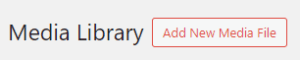
- Adding an Image to the Media Library – To add an image while in the Media Library, click the “Add New” button.
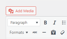
- Adding an Image while Editing a Page – To add an image while editing a page, click the “Add Media” button above the module you are working in. Before clicking the button, make sure your cursor is located where you want the image to be placed in the content. This option allows adding a new image to the media library for use, or choosing an existing image to use from the media library. Note: This button is only available in select modules.
- Adding an Image to the Media Library – To add an image while in the Media Library, click the “Add New” button.
- Optimize – For many images, the resize step will have a significant and adequate positive impact on the weight of the image file. In those cases, an additional optimization step is not necessary. However, optimization is very important for images with larger dimensions, particularly banner images. A plugin named “Smush” has been installed to automatically further optimize the images.
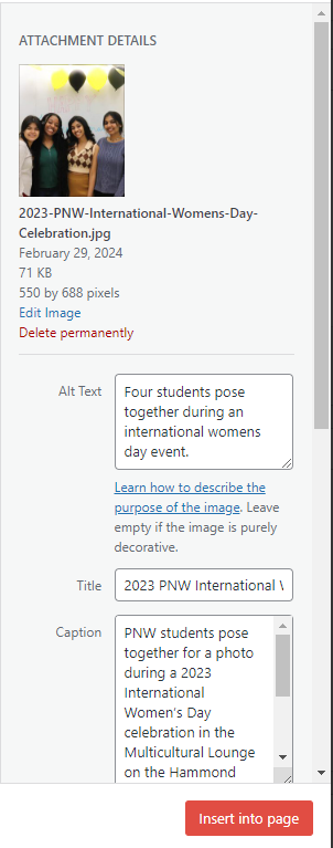
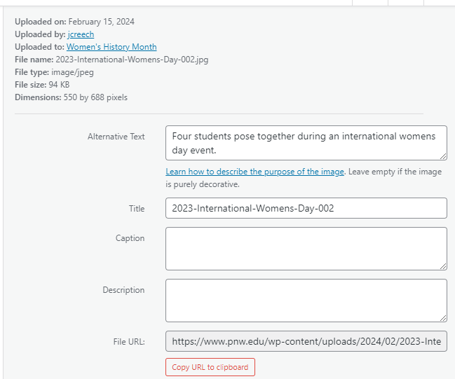
- Add additional attributes – The media item has a name/title field that is separate from the image filename. We recommend using this field to provide a short description of the image. Avoid naming the item with pages or sections of the site or with image sizes or uses. For example, “students hanging out on lawn” is a better name than “admissions hero image students”. The name of the item can be copied and pasted into the Alt Text field. Also, where appropriate, provide a caption for the image directly on the media item.
The editing pane will look slightly different depending on where you upload your photo at.