Full-Width Modules for Standard Pages
Use this page as a guide for working with modules in the full-width region of the standard page template.
The Accordion module is a template that is used to manage expandable / collapsable content areas.
The module is simple to work with and includes an outer container and one or more items. Each item includes a title field and a rich text field.
Items can be rearranged within the Accordion group by clicking on the Item number on the left side of the template and dragging the Item to a new location. Items can be removed by clicking the minus button on the right side of the template.
Videos in Accordions
- Similar to Tabs, videos can be included in Accordions with a simple copy and paste of the video’s embed code from
- While embedding videos in accordions is possible, it’s not the first choice as they don’t flex to mobile as the embed code does. Consider whether you can embed your video in the preferred “Embed Code” or “Feature w/ Video” modules.
The Cards module is a template that is configurable on the page and can be used to surface key links in a visual and prominent fashion.
The module has a heading field, a heading level selector, and a setting that determines how many cards will display in each row. From there, one or more cards can be added to the grid; each card has an image and a rich text field. The help text within the module provides guidance on the text styles that should be utilized to match the design.

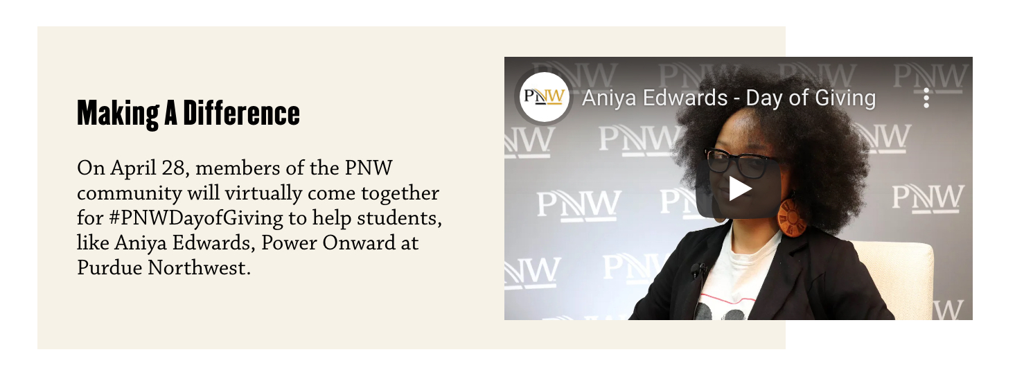
Features With Video are the primary way to embed videos on a full-width page. The layout and formatting of it looks better on a full-width page than standard embed code. Please refer to the Features With Video instructions for further detail.
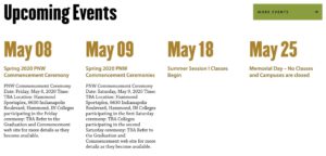
The Events module is a dynamic module that is used to display a feed of upcoming events on the page.
The system will automatically display the next four upcoming events from the website calendar that match the categories and/or tags assigned within the module. The module also has fields for a Heading and a Link.
- This module should be used if the video highlights a key “selling” point but needs a short context to better support it.
- If you need to push users to a destination, use the standard feature. If the video makes sense in the larger context of a page, an embedded video is better.
- The video should be high quality, branded and relevant to the copy, enhancing the user experience. The size of the video and the length of the text should be in balance.
- Ensure that the video on Youtube has closed captions, proper descriptions and titling. The thumbnail image that appears at the beginning of the video before it plays needs to brand appropriate. Avoid using videos with a lot of text since the size will be small unless the user opens a link to Youtube.
- Ensure the video is properly linked to avoid any broken link or layout. The video must be public and should be at least 720p.
The News & Announcements module is a dynamic module that is used to display a feed of recent news on the page.
The system will automatically display the three most recent articles that match the tags assigned within the module. The module also has fields for a Heading, Heading Level, Link and Link Color.

The Prefooter Panel is a reference module that is used to display a prominent call to action or closing message on a page. It is intended to be the last item on the page.
The module is simple to work with and has a single field that allows you to select the panel that should display on the page.

The Social Links module is a template that offers a secondary method for adding social media icons/links to the sidebar column of a page. Links/icons are added directly to the page and not reusable across other pages.
The module was implemented to support student groups with their own social media presence, separate from the primary channels managed by the university.
The module is simple to work with and includes a heading field and a field for one or more social links. The social icons are pre-built into the module.
The Text Panel module is a template that provides options for presenting text at full width.
The Text Panel has an upper section and a lower section. The upper section includes a rich text field to manage the content and a setting that determines if the text should display across the full width of the container. The lower section allows for up to three columns of content and each column is managed via a single rich text field.