Modules for Full-Width Pages
Use this page as a guide for working with modules in the full-width page template.
The Cards module is a template that is configurable on the page and can be used to surface key links in a visual and prominent fashion.
The module has a heading field, a heading level selector, and a setting that determines how many cards will display in each row. From there, one or more cards can be added to the grid; each card has an image and a rich text field. The help text within the module provides guidance on the text styles that should be utilized to match the design.

The Contacts Slider module is used to add a list of PNW faculty and/or staff to a page.
The module references a central repository of people. This allows for contact and biographical information to be managed in one place, and displayed on pages throughout the web presence.
The module allows you to select and order the people that display on the page. You can select individuals from an A to Z list or search the list. Once the person is selected, you can designate whether or not the contact card should link to the person’s profile page.
The module also has fields for a Heading, Heading Level, Content, Link, and Link Color. In the example shown below, the Content and Link were not used.

Features With Video are the primary way to embed videos on a full-width page. The layout and formatting of it looks better on a full-width page than standard embed code. Please refer to the Features With Video instructions for further detail.
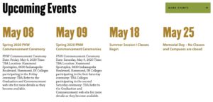
The Events module is a dynamic module that is used to display a feed of upcoming events on the page.
The system will automatically display the next four upcoming events from the website calendar that match the categories and/or tags assigned within the module. The module also has fields for a Heading and a Link.
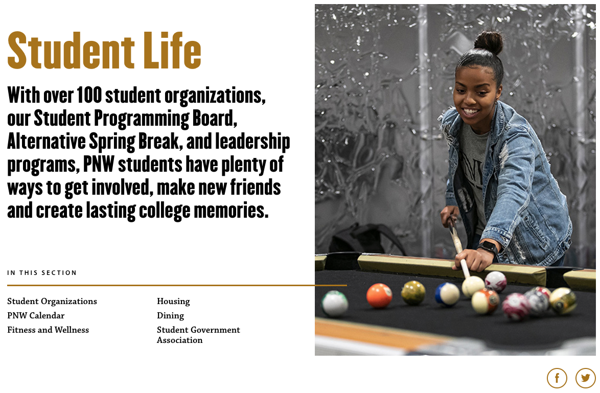
The Feature Panel module provides a template to highlight interesting or important content. It can be used to link to stories, news articles or other pages. The module includes a title, a rich text content field, an image, and a choice of placing the image to the left or the right of the module.

The Feature Panels (Multiple) module extends the Feature Panel by allowing more than one panel to be added in a group.

A max of two features per page should be used (possibly three in notable circumstances) as this element is meant to highlight information and loses its effect with repetition. For items beyond three, consider using accordions, cards or lists with link and text.
- Features With Video are the primary way to embed videos on a full-width page. The layout and formatting of it looks better on a full-width page than standard embed code.
- Utilize the remaining title/text space as you would on a standard Feature.
To Embed Code

- Embed code is the standard way we display video on the site. To embed code, open the video in Youtube, click share and copy the Embed code text. Return back to WordPress and paste that code directly into the Embed Code.
- Ensure that you add a?rel=0 at the end of the YouTube URL in the embed code. This ensures that the “suggested videos” that show up after a video ends are only PNW content. Otherwise, users can get potentially inappropriate recommendations.
- Embedding can be technical.If you are not comfortable adding yourself, please reach out to the web team.
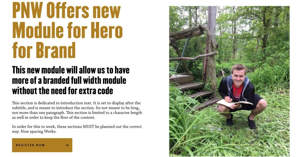
The Hero module is a template used to create the first section of a full-width page. The module has a default style and an alternate style. The main fields on the module are the heading, subtitle, image, label and links. There is also a Link Icon Set field that allows you to select the group of social links to display on the page.
A limited-use module, the Hero Alt module is intended for “feature event” pages that require a full-width layout but don’t have “children” pages in their navigation to feature. Please reach out to PNW’s web team if you are looking to use this custom module.
The Icons module is a template that is configurable on the page and can be used to display logos or icons on the page.
The module has a heading field and a heading level selector. From there, one or more icons can be added; each icon has an image and a rich text field. The icons display in rows of two.
The Image Gallery module provides a template for building an image gallery slideshow on the page. The module leverages default media library functionality. The slideshow can include images that already exist in the media library, or newly uploaded images.
The design calls for images in a 3:2 ratio. If you need to use a vertical photo, and you can’t crop in to a 3:2 ratio, you should place the vertical image at 600 px height in a 900 px by 600 px white background and save this image for use in the slideshow. This is a last-resort option; horizontal images are preferable.
Captions are optional, and managed within the media library.
Images can be rearranged within the gallery via drag and drop. Images can be removed by clicking the X button on the upper right corner of the image.

The News & Announcements module is a dynamic module that is used to display a feed of recent news on the page.
The system will automatically display the three most recent articles that match the tags assigned within the module. The module also has fields for a Heading, Heading Level, Link and Link Color.

The Panel module is a simple template used to place a three column panel with a black background on the page. The style for the second column can either be Stacked Images (as shown below) or Standard, which leverages a rich text editor. The left and right columns are managed with a rich text editor field.

The Prefooter Panel is a reference module that is used to display a prominent call to action or closing message on a page. It is intended to be the last item on the page.
The module is simple to work with and has a single field that allows you to select the panel that should display on the page.

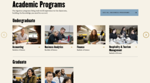
The Program Cards Jumbo Panel module is a special template that displays academic programs on a full width page.
The module has an introductory section with a heading, intro text and a button. It also has two rows that can be populated with programs. Each of the two rows has intro text and the ability to add one or more programs via a selector dropdown with built-in search capability. If more than four cards are added to a row, the system will automatically display scrolling arrows.
The Program Search Jumbo Panel module is a special template that combines a program search function with a feature panel.
The module automatically includes a program search box. Within the search area, you can designate a heading and two buttons. From there, features are added in an identical fashion to the Feature Panels module.
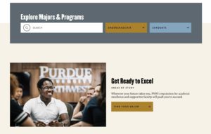
The Program Top Section module is a template used to manage the top section of academic program pages.
This is a more complex template in terms of the number of fields. The primary fields are title, subtitle, image, and body. In addition, there are two link field sets that enable buttons to be added and button colors to be designated. These buttons display beneath the title and subtitle. An accordion field set is also included and will display beneath the body field.
On the right-hand side of the template there is a form field and an optional image and/or video.

The Pullquote module is a simple template used to display a stylized quote. The module has fields for the quote and the attribution.
The Pullquote is similar to the Testimonial. You should use the Pullquote module when you’re emphasizing a quote on a single page, without plans to distribute across the site.

The Related Programs module is used to present academic programs that are related to content on the current page.
The module references a central repository of programs. This allows for program content to be managed in one place and displayed on pages throughout the web presence.
The module allows you to select and order up to three programs to display on the page. You can select programs from an A to Z list or search the list.
The module also has fields for a Heading and Heading Level.

The Social Linkbar module provides the primary method for adding social media icons/links to pages throughout the website.
The module references a central repository of Social Icon / Link groups. This allows a set of links to be managed in one place, and displayed on pages throughout the web presence.
The module is simple to work with and includes a heading field and a field that allows you to select the group of links to display on the page.
The Social Links module is a template that offers a secondary method for adding social media icons/links to the page. Links/icons are added directly to the page and not reusable across other pages.
The module was implemented to support student groups with their own social media presence, separate from the primary channels managed by the university.
The module is simple to work with and includes a heading field and a field for one or more social links. The social icons are pre-built into the module.
The Split Column module is a template used to create two columns of content.
The module includes a field for designating the width of each of the two columns within the containing region. Three options are available: 80/20, 50/50, and 20/80. 50/50 is the default option. 80/20 and 20/80 are useful when there is a need to pair text with an icon.

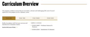
The Split Panel with Tabs module is a specially designed template that combines a tab component with additional content. It was designed to present curriculum and requirements information in one panel.
The module has a heading field and a heading level selector. From there, one or more tabs can be added; each tab has a title and two columns of text. The additional content section has a heading field and a content field and it displays to the right of the tabs.
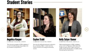
The Stories Slider references a central repository of stories. This allows for stories to be managed in one place, and displayed on pages throughout the web presence. This can allow the display of stories/news items without chronological consideration.
The module has a heading field and a heading level selector. From there, one or more stories can be added via an A to Z list or search.
The stories display three across on the page. If more than three stories are added to the slider, the system will automatically display scroll arrows.
The Tabs module is now available on the “Full Width” template. It functions just as it does in the standard template, allowing for content to be placed in tabs, and on mobile devices in accordions. The major difference here is more tabs can be used as compared to the standard template.
It’s recommended that if using full with tabs, you have at least 3 tabs, with content that is similar in length. Since this is a full width module, more content in these block helps make the page look full. These tabs can be used to display text, images, tables, and other forms of content necessary for your website.
The Testimonial Slider references a central repository of quotes. This allows for quotes to be managed in one place, and displayed on pages throughout the web presence. Testimonials have the same design as Pullquotes.
The module is simple to work with and includes a single field to select the testimonial to be displayed. More than one testimonial can be selected if desired.

The Text Panel module is a template that provides options for presenting text-based content at full width.
The Text Panel has an upper section and a lower section. The upper section includes a rich text field to manage the content and a setting that determines if the text should display across the full width of the container. Follow the helper text to apply the design styles for the module.
The lower section allows for up to three columns of content and each column is managed via a single rich text field. The Text Panel is intended for text-based content and is not designed for images.


On the Full-Width Template, the Visual Editor (WYSIWYG) module is used to add text-based content to the page. It includes a rich text editor with a variety of options for formatting and displaying content.