Styles
The PNW website provides several pre-styled options to format content.
Headings help organize your page and make content easy to scan for both users and search engines. Using them correctly improves readability, accessibility and SEO.
Headings should follow a logical order (for example, H2 followed by H3) so that the content is clear and easy to understand. Heading tags are pre‑styled to match the PNW design. To apply one, highlight your text and choose a heading from the first drop‑down menu in the editor toolbar.
Explore Heading Styles
Heading 1 (H1) is reserved for the page title and should not be used in the body of the page.
Heading 2 Example
Heading 2 (H2) is used for main sections on a page.
It helps organize your content into clear parts, making it easier to read and understand.
Heading 3 Example
Heading 3 (H3) is used for smaller sections that fall under the main section (H2).
It helps structure and organize the large amount of content into more detailed sections.
Heading 4 Example
Heading 4 (H4) is used for smaller sections that fall under the subsections (H3).
Heading 5 Example
Heading 6 Example
Please keep in mind that Heading 5 (H5) and Heading 6 (H6) are rarely used on pages. They are typically only needed for very detailed content.
Explore Text Styles
When working with text styles, it is important to use formatting that will be clear to readers. Learn about what text styles you should use on your pages, events and posts to highlight important content.
Large Paragraph Example
The Large Paragraph text style is ideal for introducing the content of a page.
It works well beneath a Heading 1 (H1) at the top of the event, page or post, helping to highlight the key information and set the context for the remainder of the content.
Small Paragraph Example
The Small Paragraph text style is useful when presenting supplemental information less prominently.
It is primarily used for captions, disclaimers, or any fine print notes about an event, page or post.
Title Example
The Title style is useful when a subheading is needed for readability purposes, but not structural or hierarchical purposes.
Subtitle Example
The Subtitle style is useful to complement the Title or as a standalone style that helps with readability and does not impact the page hierarchy.
All Caps Example
All Caps is another style that is useful to complement the Title or as a standalone style that helps with readability and does not impact the page hierarchy.
Link Styles
*When using a gold link, please bold the link text to meet accessibility standards.
Creating Buttons
- Type out what you would like your button to say. For example, “Register to Attend”
- Highlight the text, then click the “Insert/edit link” or “chain” icon in your toolbar
- Paste your link into the textbox that you want the button to lead to
- Click “Enter” or the blue arrow to apply the link
- To choose your link style, click “Formats” in your toolbar and there will be button options to choose from that best fit the formatting of your page.
Using Buttons
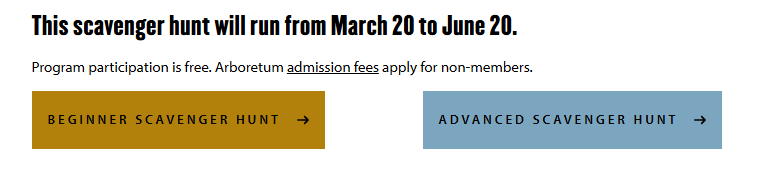
Gold Button
Gold is the primary button. It is used most often and by default for important calls to action and routing to key pages.
Blue Button
Where more than one button is used, combine blue and gold buttons. Use the gold button as the most important call to action. For example, if you have two links that need to be right next to each other, changing the color makes it easier to read and see the two different links clearly.
CTA Link
Use the special link style called CTA Link to draw attention to an action someone can take. These have less emphasis than a button, so avoid using these for primary calls to action.
Gold Link
Use the special link style called Gold Link in link lists to call attention to the linked item. Follow the link with a short description to allow visitors to scan information and find what they’re looking for easily.
Please note: A gold AND blue button must have already been used before a green button can be added to the page.
Combinations
Text combinations are used very often throughout the website. Sometimes you need to choose a heading tag based on its place in the page structure, even if the default style does not look readable or aesthetic. In these cases, you can adjust the styling without changing the page structure.
Heading 2 with Title Style
Heading 2 with Subtitle Style
Heading 2 with All Caps Style
Heading 3 with Subtitle Style
Heading 3 with all caps style
If you cannot see the style options above when logged into WordPress, your toolbar is likely toggled “off.” To change this setting, click the third icon from the right or press Shift+Alt+Z. The icon resembles two rectangles and will read “Toolbar Toggle” on hover.
Additional styles, such as the link styles, will be available in the drop-down box labeled “Formats.”